girlprinter
DSC01082Nobody ever has fun on our annual trip to Wilson's Prom.036035034032029

NEW WEBSITE 2012 www.carolynfraser.com

    The Art of Photo-Engraving

    From the introduction to The Art of Photo-Engraving, 1929: “In these days of hustle and bustle and in a land accustomed to the translation of visions and dreams in terms of steel, concrete and marvelous machinery, a jaded army of sophisticates was thrilled by the appearance of a most unusual book.

    A book utterly devoid of poise or posture, purely technical and educational; yet a surprise and a sensation. A book acclaimed by all who saw it and prized by those so fortunate as to obtain a copy. A book for which ten times its original and advertised price was offered. This book is Achievement in Photo-Engraving and Letter Press Printing, 1927.”

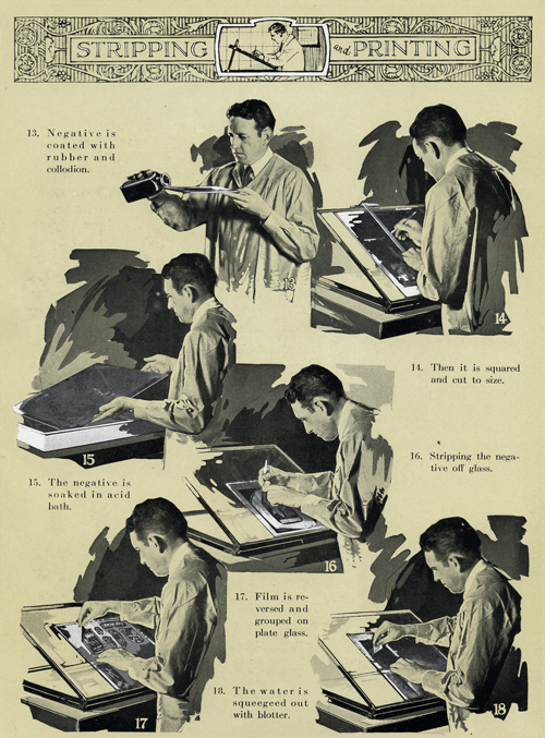
    The section on the art and process of photoengraving was reprinted in 1929 by Printing Plates Incorporated, Oakland, California. The following illustrations explain the process step-by-step, circa 1929.
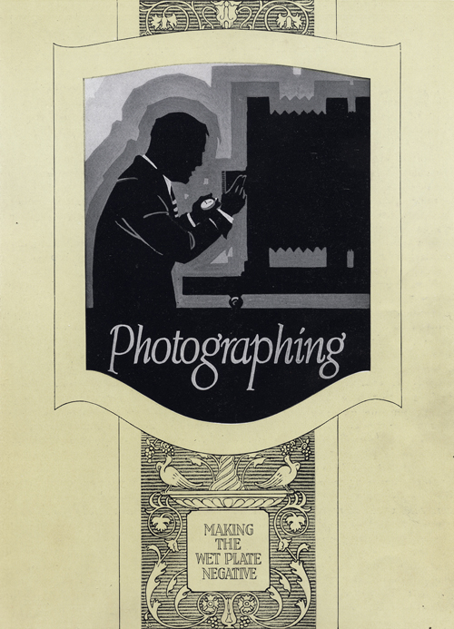
    To be continued.

    Stripped

    Crossed-posted at Meanjin’s Spike, 1 March 2011.

    Over lunch at Mr. Tulk some time back, former Meanjin editor Sophie Cunningham, writer Caroline Lee, designer Stuart Geddes and printer Carolyn Fraser – all friends – discussed design ideas for the jacket of the limited edition of Lee’s novel Stripped, which Cunningham published in installments in Meanjin during 2008-2010. Concepts were discussed; practical matters broached. Lee and Geddes floated ideas of degradation, mutability, a design broken down over the course of the print run. Fraser was seen to noticeably stiffen, and in response made clear that such a direction flew in the face of everything she stands for as a craftsperson, and soon left the table in a manner which may have been construed as in a huff, but was, in fact, simply due to her being in a rush. This is the stuff of collaboration.

    Stripped will be published in a limited edition of 500. The covers were printed letterpress by Carolyn Fraser over two weekends on a Vandercook SP-15 Proof Press, using magnesium plates supplied by Owosso Graphics in Michigan, USA. The design, by Stuart Geddes, involves the overlay of a sans serif title page with a geometric form over the detailed pattern of Victorian-style typographic ornament. The original idea was to overlay white on red, however, despite its name – Opaque White – the white ink was definitely not opaque and was lost in the red background. After consultation with Geddes and Lee, it was decided to try red on red, with pleasing results. Ten hours later, the covers were ready.

    Stripped will be launched on Tuesday, March 15th, 2011 at fortyfivedownstairs, 45 Flinders Lane, Melbourne from 5.30–7pm.

    For further information, see www.carolinelee.com.au. Books can be purchased at Pozible.

    20110127_01

    20110127_02

    20110127_03

    20110203_10

    20110203_06

    20110127_04

    Stripped-Final-02

    Stripped-Final-01

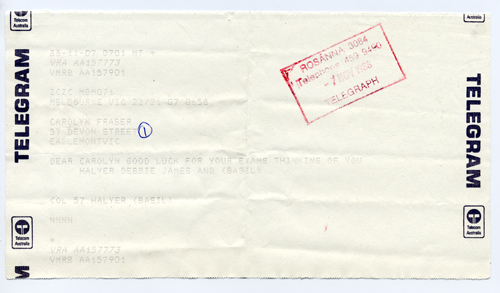
    The last telegram?

    It is turning out to be surprisingly difficult to work out when the last telegram was transmitted in Australia. The Powerhouse Museum suggests that it was in 1983. I received this telegram however from my cousin (and his wife, baby son and dog) in 1988. For a Gen Xer, there’s nothing like telling a young person that you remember telegrams to make you feel old.

    New workshop dates, 2011

    January 22 & 23
    March 12 & 13
    May 21 & 22
    July 16 & 17
    September 24 & 25
    November 12 & 13

    More information here.

    Idlewild Press, relocation 2010

    Dorian, inspired by the TV show ‘Monster Moves’, suggested the following plan for the move between the old and new studios:

    Move the Nicholas Building to Collingwood. Unload the presses. Return the NB to the CBD.

    And this is (almost) how it happened.

    There’s a story to be told, but in the meantime, I am looking for an extra pair of hands. I need someone who can work with me on Mondays for four weeks to help me set up the new studio. You’ll be helping me shift and unpack boxes, distribute type*, organise samples and paper stock. In exchange, you’ll have a place in one of my weekend workshops, where you’ll print a project of your own. E-mail me if this sounds of interest, and tell me a little bit about yourself. Ideally, you’d start September 27.

    The new studio is in The Compound Interest Centre for The Applied Arts, 15-25 Keele Street, Collingwood, in a double-wide, saw-toothed factory set to be tenanted by some very talented people. I am very lucky and excited to be included among them.

    *Unfortunately, there was a small accident during the move, resulting in a galley of pied type.

    Rare Book Summer School Day 5

    Rare Book School Days 3 & 4

    Printing letterpress can feel a bit like the ascent up the steepest grade of an old-school roller coaster. A slow ratcheting up and up, until finally, the momentum of printing itself takes over. I find myself needing to encourage and reassure through what can seem like painfully slow steps: typesetting, proofing, correcting, proofing again.

    This weather hasn’t helped. A week-long swelter, it’s hollow humour to suggest that it adds to the 19th century ambience of the enterprise. A thoughtful someone at the State Library arranged a tab for us at Journal Café and their lemon granita hit the spot this afternoon.

    Yesterday and this morning saw us proofing the type and making corrections. Page formes have been assembled. Rosalind Atkins, well-known for her exquisite engravings, is in the class and offered to cut a block for us. The chapbook will be bound in a soft wrapper imprinted with the title. This involved a certain amount of gerry-rigging to print a 70cm long sheet on a 10×15 platen, but was possible with a team of five.

    The storm started in earnest in the midst of this critical activity, a perfect time to discuss printing damp. Tomorrow is expected to be a welcome 22ºC, perfect weather for handling paper.

    Rare Book Summer School Day 2

    The story we are printing is Cate Kennedy’s Chiapas, 1965. It is a story about first contact between Westerners and the Lacandon Indians in Chiapas, Mexico. At first, it is lyrical, incantatory, disorienting. The last part of the story reads like whiplash, stops you dead with a sudden blast of shameful recognition and indictment.

    There is always fear involved when setting type. Will I have enough sorts?*

    We are setting Cate’s story in Van Dijck, a classic book face that I consider my house face. I’m quite confident we’ll have enough sorts, less so spacing. Just as letterpress requires the setting of each letter one by one, the spaces between words are created using small pieces of type metal cast in divisions of an em. An em is a unit of measure relative to type size: a 12pt em is 12pt square, an 18pt em 18pt square. The name “em” comes from the fallacious claim that a capital M is always a perfect square. Spacing narrower than an em is called an en (half an em), 3-em (3 pieces=an em), 4-em (4 pieces=an em) and 5-em (5 pieces=an em.) Quads are multiples of the em; thins (brasses and coppers) are divisions of the em.

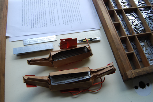
    In setting type at this size, the 4-em is the most used space between words. I was worried that we may not have enough. By mid-afternoon, the 4-em tin was worryingly empty. I was searching in other job cases, ready to cannibalise when I could. If necessary, we could print all the verso spreads, distribute, then set the recto, but this would be a drag. Finally, I thought to unwrap two packages of unidentified foundry spacing, never before opened. Both were filled with brand-new 12pt 4-em spaces. Huzzah!

    *A note on the term “sorts”: Typographers gnash their teeth over the contemporary misuse of the word “font” in place of “typeface.” A typeface is sold as a font, either in metal or as digital files. The font is the collection of sorts that make up the typeface: all the letters, punctuation, ligatures, figures, and diacritic marks designed for the typeface. The font is the collection of parts that make up a typeface, not a term to describe the design of the face itself and the characteristics and features that distinguish it from another face.

    Rare Book Summer School

    Four or so years ago, I was asked if I’d be interested in teaching a week-long letterpress workshop for the Rare Books Summer School. I said was, contingent on my finding a studio. In the years that followed, I’d occasionally run into the organiser, who, in his enthusiasm, would scare me into thinking the workshop was imminent. When is it? I’d ask, worried. His response: February, 2010. Ages away.

    It is now February 2010. The workshop begins tomorrow. There are six of us, five students and me. My plan is for us to produce a chapbook, in a limited edition of about 100. The story is something special, previously unpublished. I plan to post about our progress everyday. By Friday, there should be a new book in the world.

    Don’t Carry Inflammable Articles (Your Lucky Number 6)

    I wasn’t sure what these machines were when I first saw them on train platforms in India. Carnival games? Fortune-telling machines? Neither: they’re weighing scales. As was pointed out to me in Mumbai when I went to set my bag on the ground, there is a handle on which to hang your stuff as you stand on the scale. A little card pops out with your weight printed on it. I tried two machines, but have more faith in the calibration of the one that spat out the lower number.

    Like fortune cookies which also suggest lotto numbers, the “health cards” are comprehensive in their sources of advice. Your weight, your lucky number, a fortune, and a practical tip about know not to get killed in a rail-related way. According to my cards, this year is “A favourable year for money-making and for all matters of affection and friendship” and “[I] excel in matters of judgement, analysis and instinctive reasoning.” Which is why I probably won’t walk along the railway tracks or carry inflammable articles.

    I’ve finally uploaded my photos from India to flickr. They’re here if you’re interested.

    And if you’d like to see some truly gorgeous photographs from India, have a look at Meena Kadri’s amazing photographs here.